Rocket® is the nation's leading online mortgage lender...
...but they had a problem
connecting with first-time home buyers and growing revenue through existing customer relationships. Our team was challenged to change that.
role | design lead
responsibilities | creative direction & branding, user research & testing, product design

So, we overhauled the user experience & branding
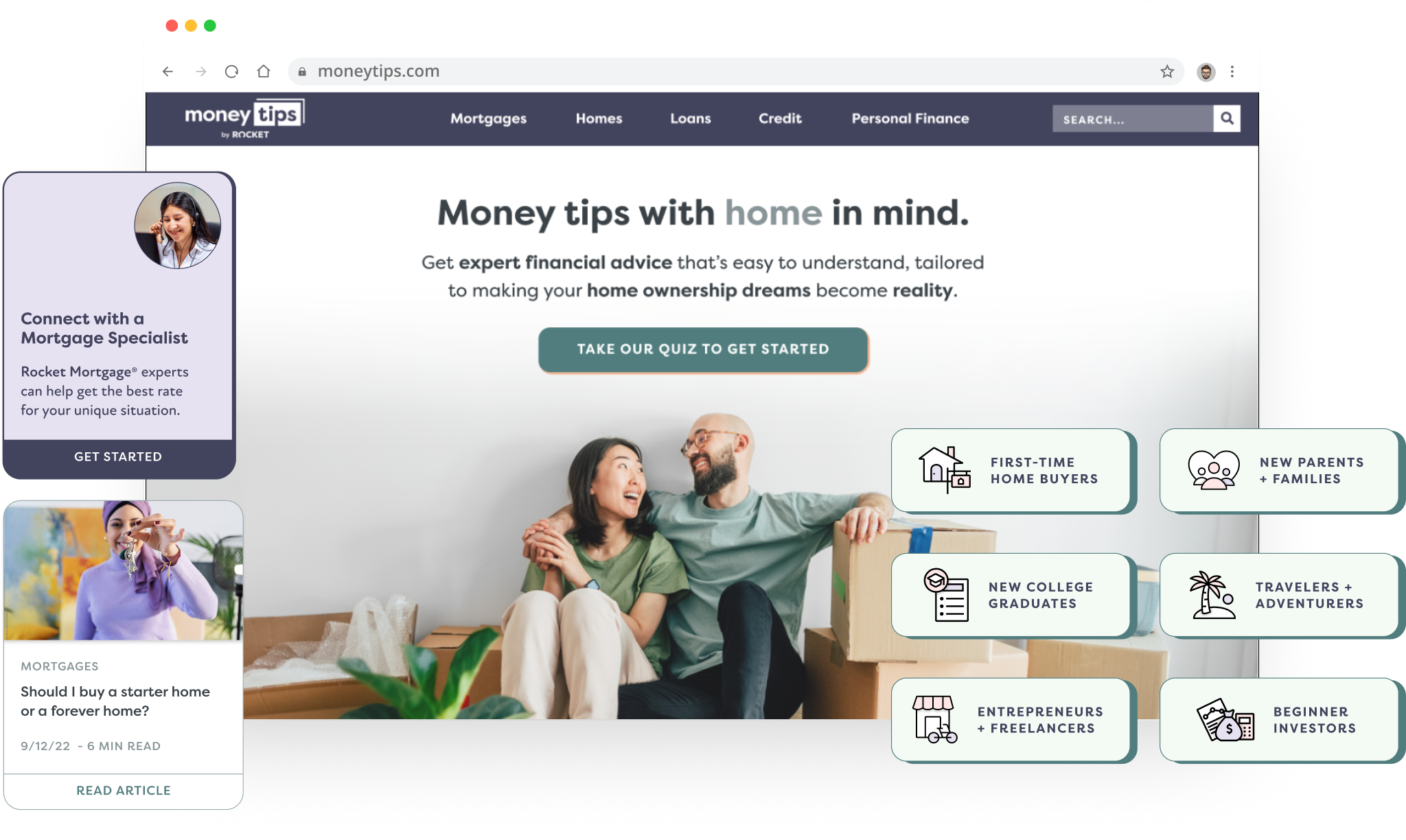
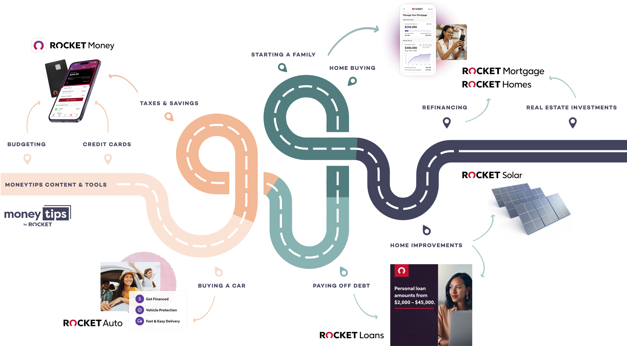
of their subsidiary product, MoneyTips, to better support all properties within the Rocket® ecosystem and create clearer connection points over a lifetime of milestone moments.
the results in
14 months
500+ application leads per quarter
for mortgages, personal loans and app subscriptions
8x organic traffic across the site
from <50K to over 400K site visitors per quarter
13% referral of all site traffic
to other Rocket® sites and products
the opportunity: increase the predicted customer lifetime value by $1,000's
1. define
• competitive benchmarking
• user research
• usability testing
User interviews, behavioral data, heat maps and competitive analysis were leveraged to guide the re-design strategy and ensure user expectations & market standards were met.
Tools:
Google Analytics
Kantar Desktop Research
Respondent
Mouseflow

Competitive Benchmarking | We identified these 6 primary improvement areas out of 12 heuristic categories.
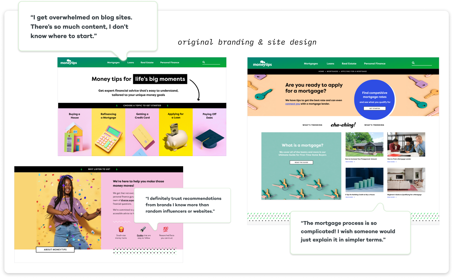
User Interviews & Usability Testing | 10 participants, female & male, ages 25-47 actively applying for a mortgage in the US. Consisted of 35 min. moderated interviews including task completion, ranking ease of use, and brand perception.
research take-aways
Low Trust
Users were unclear who owned MoneyTips and therefore whether the content was trustworthy.
Poor Brand Perception
Younger users appreciated the playful aesthetic, however majority found it distracting and compounded lack of trust.
Navigation Hurdles
Users struggled to find what they were looking for due to inconsistent hub structures, lack of filters and confusing labels.
Fragmented Experience
Users felt there were too many intrusive and “sales-y” elements such as lead form pop-ups and CTAs that were out of context.
2. design
• revamped identity
• information architecture
• wireframes & hi-fi comps
I leveraged research insights to focus the re-design on a refined, simplified brand balancing approachability with trustworthiness.
We optimized user flows and enhanced the overall experience by simplifying the site architecture and improving consistency throughout the site.
Tools:
Figma & Figjam
Adobe Creative Suite
Jobs to Be Done Framework
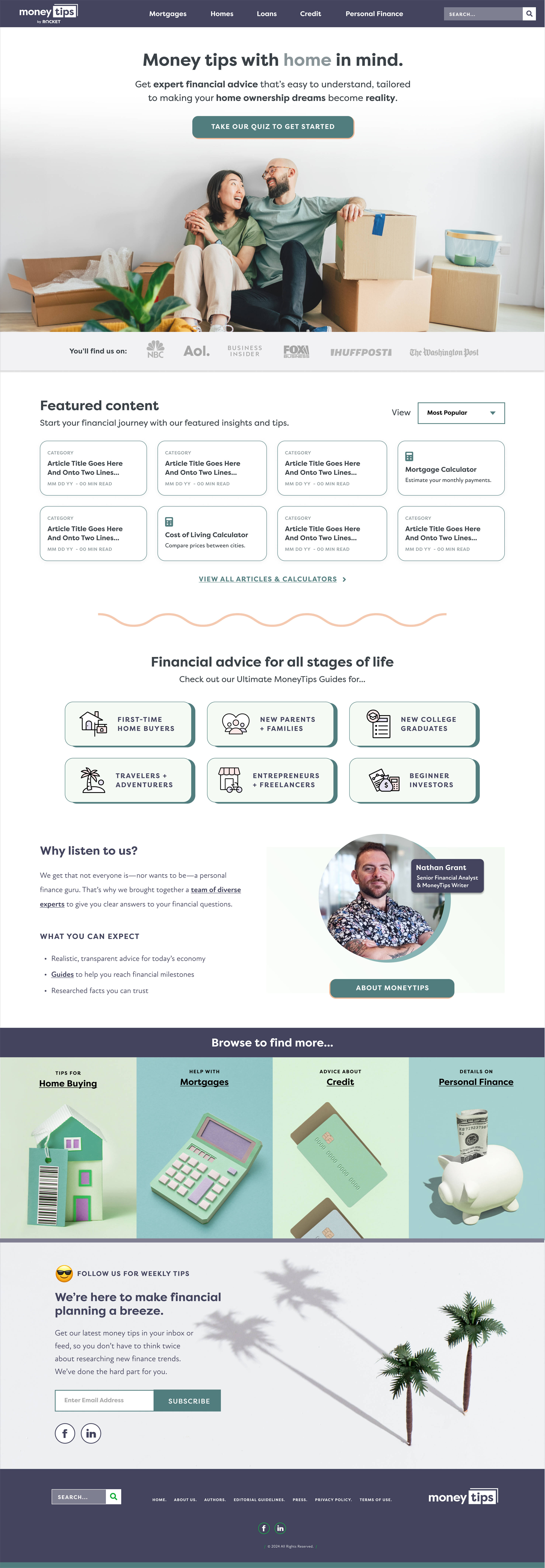
Refined Identity & Art Direction | Created new wordmark and added ‘by Rocket’ to increase credibility and authority for users. Softened color palette, achieving greater sophistication while retaining approachability and playful touch to connect with younger audiences.
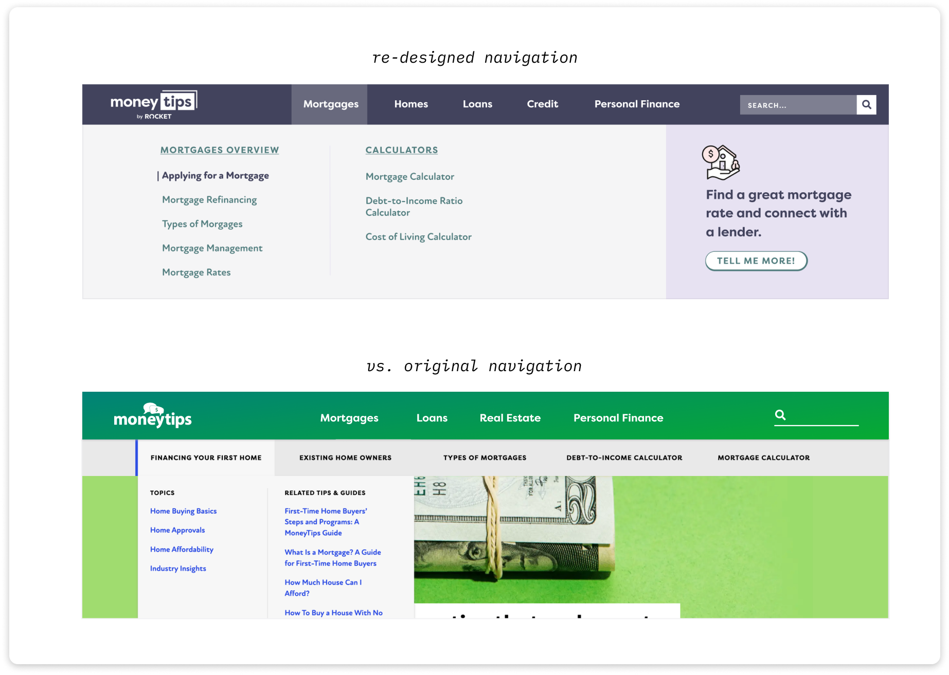
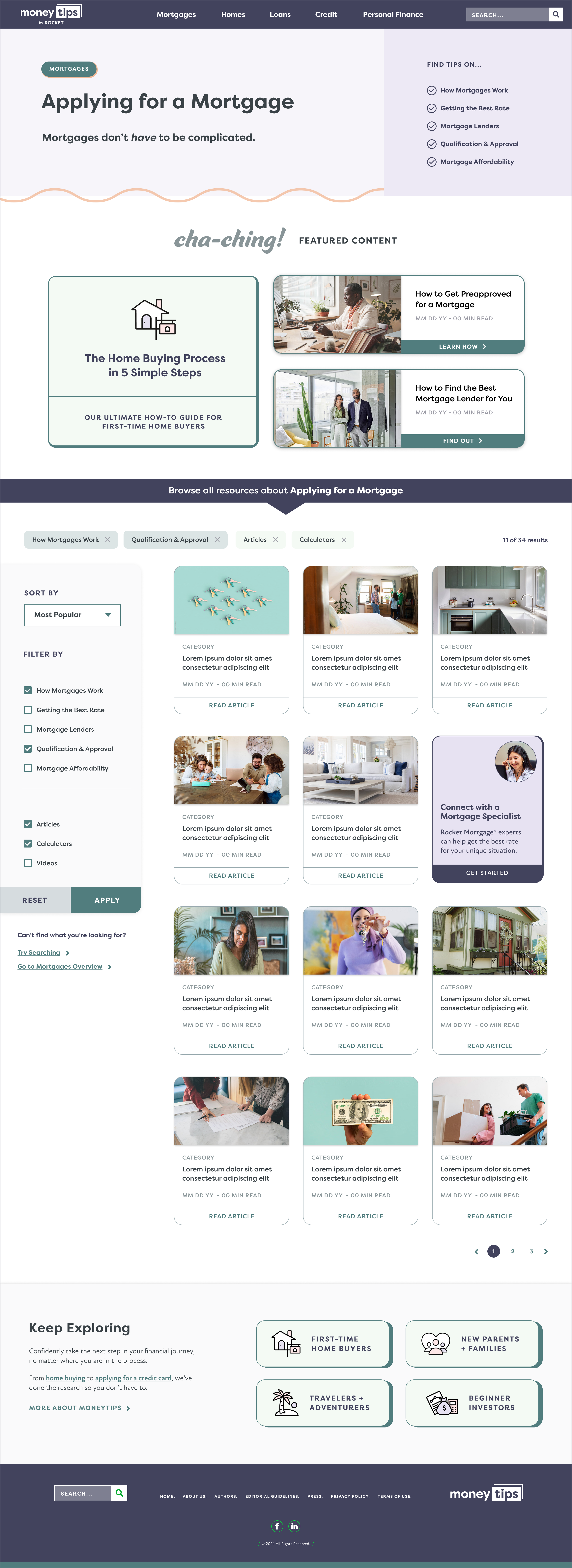
Improved Information Architecture | Simplified content organization from 3 levels to 2. Used labels that matched user mental models & ranking keywords while reducing length. Reduced cognitive load & added contextual CTA with conventional mega-nav.
hi-fi comps for homepage and category landing page
3. deploy
• iterative prototyping & dev
• refined CTA strategy
• ongoing analysis
Once the Redesign MVP was launched, we continued to design new tools to increase conversions including advanced calculators, guided experiences and a quiz to curate a personalized experience.
We refined our CTA strategy for better contextualization and integration with Rocket® systems and conducted pre/post analysis after 30-60 days to assess impact.
Tools:
Figma & Figjam
Google Analytics & Adobe Target
Mouseflow
Dovetail
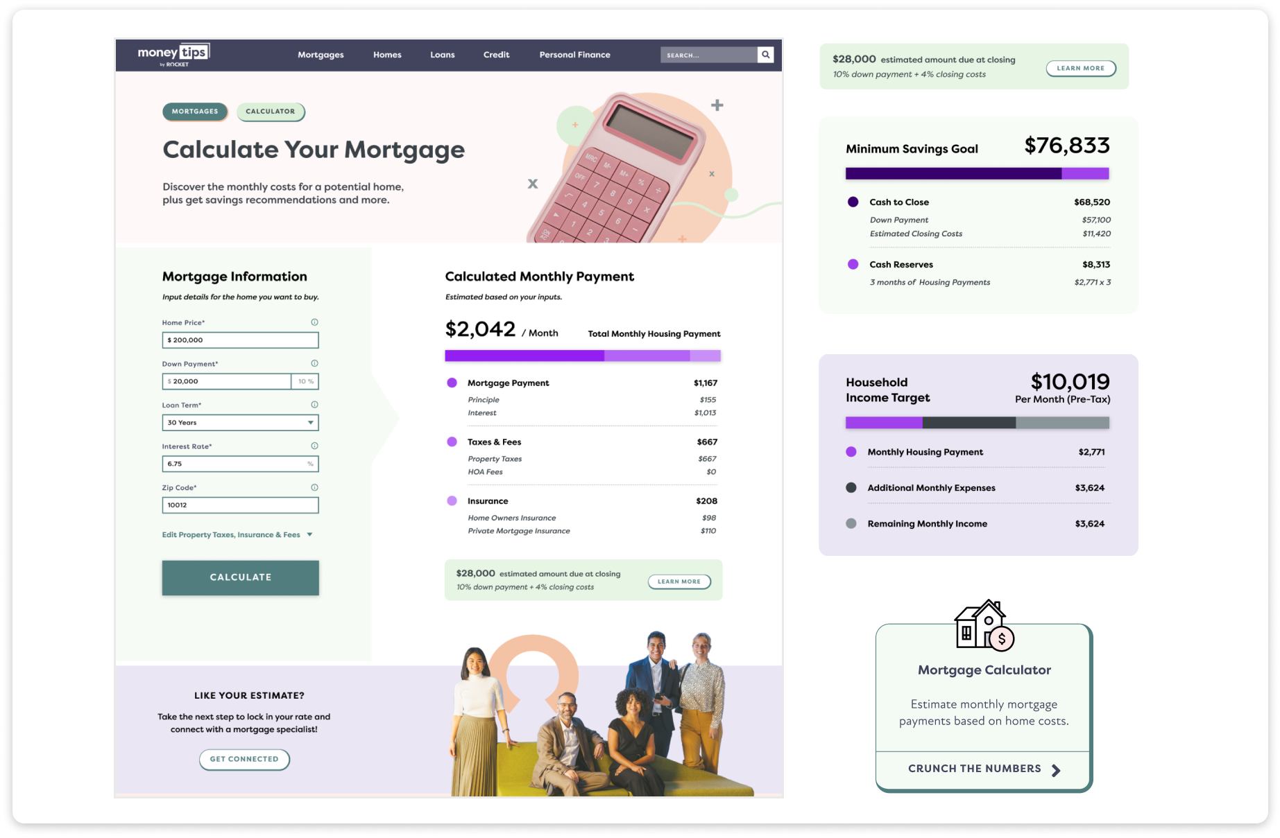
Interactive Calculators | We were able to increase referral traffic by 8% through introduction of advanced calculator tools including a Mortgage Calculator, Compound Interest Calculator, Rent vs. Buy Calculator and Debt-to-Income Ratio Calculator.
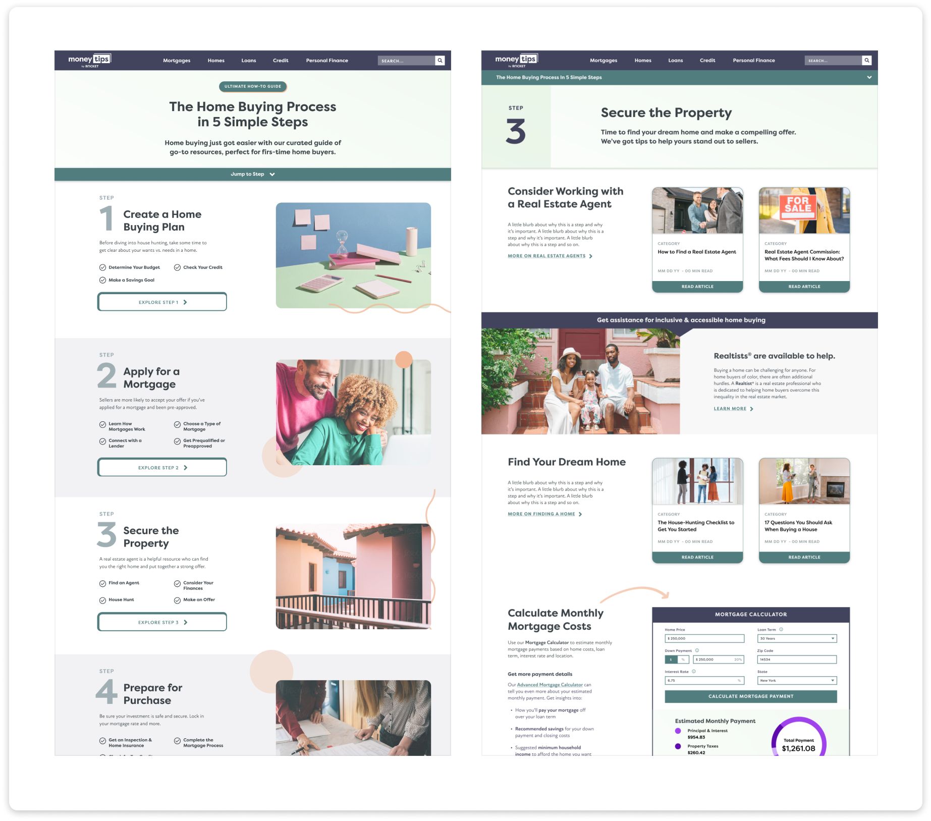
Guided Experiences | The most consistent feedback we heard from users was that they were intimidated by the mortgage process and that it was hard to find the content they needed at the right time. We designed curated guides to simplify the experience and reduce the effort users had to put into searching, browsing and assessing 100s of articles, calculators and videos.
prototype of user flow from guide to calculator
shout out to my primary collaborators
UX Lead Tami M. | Web Dev. Meghan P. | Content Lead Nick F. | SEO Lead Abigail B. | Account Manager Emma Z.
keep exploring
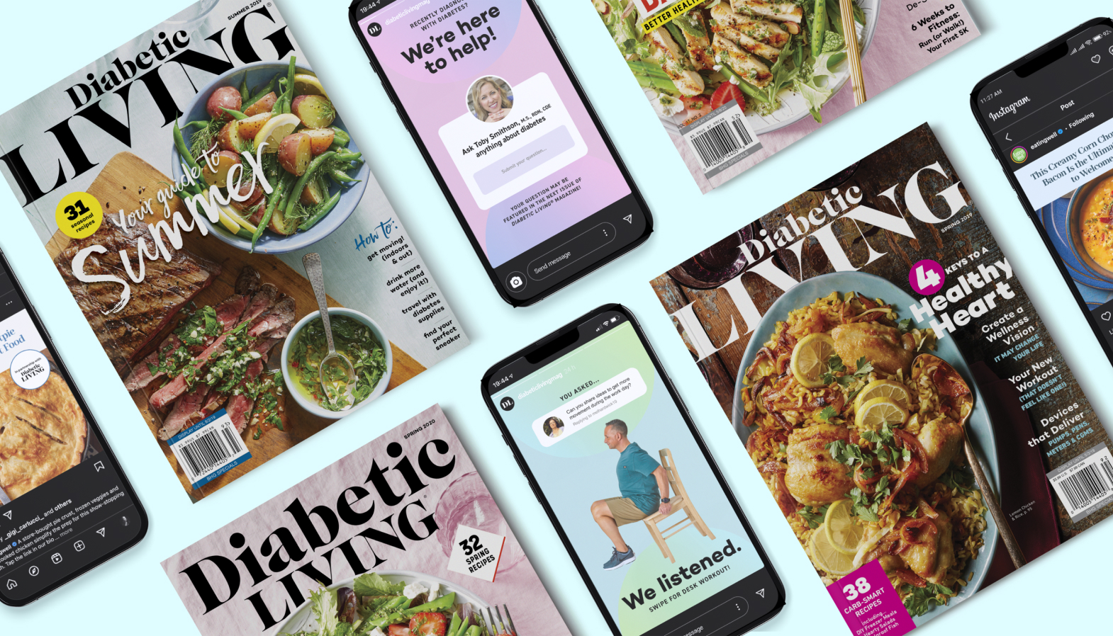
Diabetic LivingArt Direction, Branding, Print & Digital Design
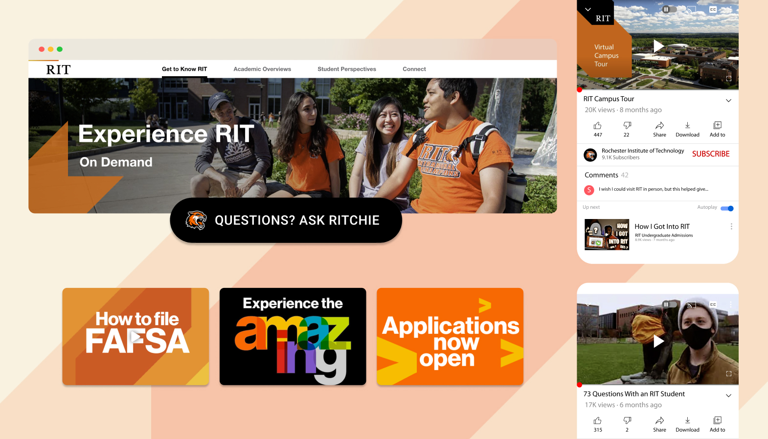
Rochester Institute of TechnologyUX, Web Design, Social, Marketing